
Colours that work
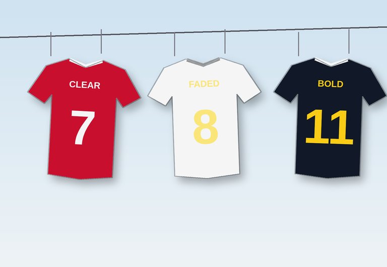
Good club colours do two jobs: they look great and they make the team easy to recognise. For shirt numbers, there is a third job – they must be readable from the top row of the stand.
Contrast is everything
Designers measure readability with a contrast ratio, the same idea used to make websites easy to read. A ratio of at least 4.5 to 1 is good; 7 to 1 or more is excellent. Test your own combination:
Shirt number contrast check
Loading…
Combinations that rarely fail
- A strong main colour with white – red and white, blue and white, green and white.
- Dark and bright – navy and yellow, black and gold, claret and sky blue.
- For the away kit, swap the main and second colours, or choose white or a dark colour.
Patterns and numbers
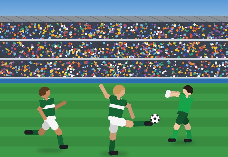
Stripes and hoops can make numbers hard to read. Many clubs print numbers on a plain panel or use a colour that stands out from both parts of the pattern.